Happy Indigenous Peoples Day, mah friends.* I got this interesting letter the other day. Let’s take a look and have a talk.
Message:
Hi Peacebang,
I am currently getting ready for my first CPE [Clinical Pastoral Education] interview. I am trying to decide what to wear and what pieces to add to my wardrobe down the road when I get closer to actually doing CPE.
I loooove a suit and I have a fair collection of professional appropriate clothes. Except: they are a bit on the loud and bright side. I love bold patterns and super saturated bright colors and jewel tones.
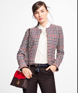
I’m in the south applying for CPE in the south. I’m southern enough to know that my professional wardrobe is too eye catching for CPE generally and it is for sure too eye catching for CPE here.I’m pretty sure that CPE is not the place for my bright red blazer or my blue monochrome suit outfit. Or my white blazer with black faux leather collar. Or my hounds-tooth blazer. Or ….many things.
I can do a few all black outfits but every time I put one of my SUPER COLOR shells underneath my black jackets I think I look like I’m headed to a political convention.
Do you have any suggestions for toning down a pop-y wardrobe without resorting to all the earth tones I hate? (they look fine on other people and forests)
Thank you for your awesome ministry!
May your day be bright and your sleep deep,
—
Dear Thoughtful Chaplain-To-Be,
Preparing to do CPE is a great time to consider your developing clergy image. You’re asking all the right questions: how well does my personal preference in attire work in my ministry context?
You have wisely assessed your geographical context (the South) and your professional context (chaplaincy work) and considered the typical choices for that context (earth tones) and are putting it all together, showing a willingness to edit and adapt your own style to suit your ministry. Brava! That non-defensive wisdom will serve you well in your work, so you’re already ahead of the game!
So, I’m thinking about what you said and about what you’ll be doing.
My first thought is that much of CPE happens as we minister to those in beds and wheelchairs and it’s considerate not to want to strain their eyes. On the other hand, maybe a dose of hot pink is just what the doctor ordered!
Busy patterns are not restful to the eye, I agree. Houndstooth is a classic neutral pattern but I’d save it for days you’re not visiting patients. Bright red is a wonderful power color but very hard on the eyes in close proximity, so yes, retire that blazer for patient days.
“Shall we pray?”
“Can I keep my eyes closed? I’m already getting eye strain.”
“Hello, I’m the Chaplain, can I visit with you for a moment?”
“Sure, but can you take off that blinding tie though?”
The houndstooth pattern of his jacket is nice and small but the lines in the tie are eye-straining.
“Hi, how are you this morning?”
“I’m doing well, chaplain. I like your jacket. Very fashionable but it’s making me squint.”
“Good morning, it’s so good to see you again. Are you up for a short visit?”
“I’d like that very much.”
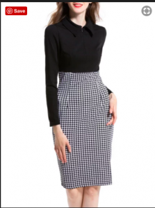
Save the houndstooth pattern for the lower half of your bod.
You mentioned black as the kind of default option for toning down your cherished eye-poppin’ looks. But how about eggplant purple? How about navy? How about charcoal grey? Those can be non-blah-earth-tones that could be paired with brighter tops. They’re rich and restful enough on the eye and won’t upstage your face and eyes, which will be the focus of most interactions.
* I wrote this weeks ago!
I learned this year that it’s not Indigenous People’s Day but Indigenous Peoples Day — no apostrophe needed because the day honors the entire diversity of indigenous peoples.


Comments
Post a Comment